The taskbar in Windows 11 is an inconvenient step backward; You can get Windows 7 style taskbar here is how
Why did Microsoft remove so much functionality from a business-oriented operating system?
Dedicated PC users have a ritual that they follow. We all keep an eye on new Apple events (whether we confess it or not) to see what strange things the other side of the computer aisle is up to. We laughed a few weeks ago when Apple added the “iconic” screen notch to its MacBook Pro notebooks, ostensibly for no other purpose than to narrow down the bezels. Despite the fact that Windows has had face-scanning technology for years, it did not make the journey.
Oh, how we laughed. The new MacBook Pros appear to be a sobering mix of reluctant steps down and strides ahead that no one asked for, thanks to this perplexing decision, the removal of the half-measures Touch Bar, and the addition of ports that Apple laptops abandoned years ago.
But, PC purists, let’s save a bit of humble pie for ourselves. The Windows 11 taskbar is Microsoft’s new flagship product, and it has a design problem that is at least as obvious.
Two steps back, no steps ahead
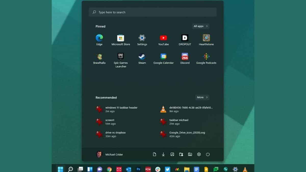
The new taskbar’s primary difference is that its tools and shortcuts are now in the center, similar to the macOS dock and (possibly a better parallel) the ChromeOS taskbar. Microsoft continues to insist on including more capabilities next to the Start button that I have never seen anyone use. However, the most upsetting change is that the headline text of window elements is no longer visible.
This means that even if you have a dozen objects open on your desktop—as I frequently do—you’ll see a row of relatively small icons, with only a few pixels of evidence that some items, such as your browser or Windows Explorer, have numerous windows.
This scrunched-up interface is definitely favored by Microsoft, as it has been the default design since Windows 7’s release in 2009. And it makes sense: the design combines the taskbar’s window management features with the Quick Launch toolbar, which was initially introduced in Windows XP.
Integrating these functions is a logical way ahead as users become more accustomed to a combined launcher and window manager. It’s a needless but harmless cosmetic change to move them to the centre of the screen.
Taking away the ability to see which products are which via text at a look isn’t sensible. Microsoft kept the option to name started apps in Windows 7, 8, and 10, hidden in the taskbar’s settings menu but still accessible to most users. It’s gone with Windows 11: Microsoft is now forcing you to use those large, lonely icons without text labels, as the competition does.