

It seems Google is working to improve how search results look. Recently, we reported that mobile search results showed the permalink above the publication’s name, with the favicon next to it. Now, we’ve noticed another change in mobile search results.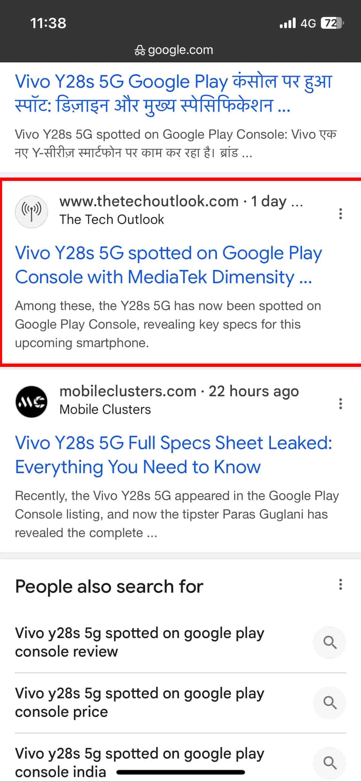
Looking at the screenshot above, you will notice the change I am referring to. In this version, the favicon is placed on the extreme left. Only the domain name and the publication name are visible along with the meta description and headline, placed one above the other. Another major difference is that the publication date or how old the article is can also be seen. Earlier, the time was placed next to the meta description just below the headline. And as per this new sighting, the date or time has been given more visibility.
Now, whoever is looking for information will see the headline first, and all the relevant information is immediately available. There has been no official word from Google about this new mobile search display. This new look has now disappeared, just as it did before. Testing is still underway, and we will likely see more changes in the coming days as Google continues to refine the search experience.