It has now been revealed that Google is testing two new UI layouts for its Circle to Search feature. Among the two, one of them is suggested to be rolling out on a wider basis.
Read more about the update below.
New Circle to Search Feature in Tests?
Google’s Circle to Search feature that has been made available across newer Android devices, while being simple, is a very useful and most often accessed feature by users. Its easy accessibility and seamless operation caters to the curiosity needs of users, making it a big deal for Google. With these reasons taken into account, Google aims to further improve and enhance the user experience offered by Circle to Search. Now, it has been reported that the brand is testing two new UI layouts for Circle to Search, and one of them seems to be already rolling out widely.
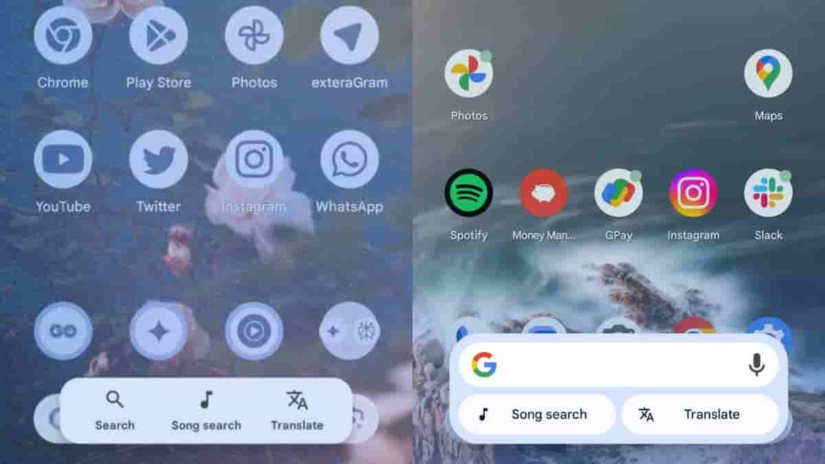
About the current Circle to Search UI layout, it appears in a horizontally-placed elongated-pill-shaped unit with the Google Search bar, Song Search, and Translate icons. The new Circle to Search layout is being tested in the Google app v16.17.38, and one of them has a rectangular box-like unit with rounded corners whereas the other has a similar design but with a two row arrangement.
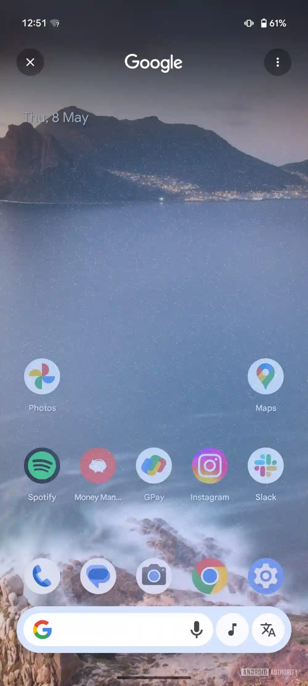
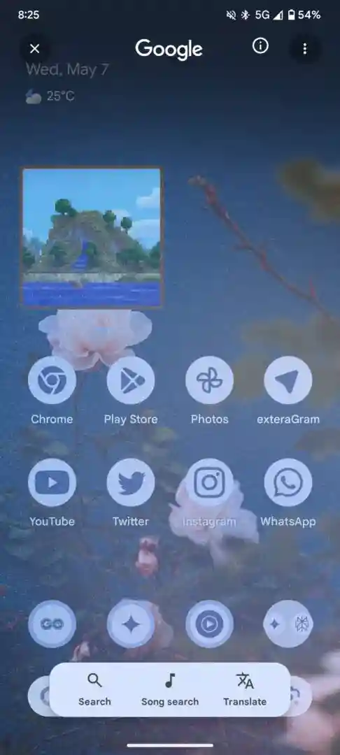
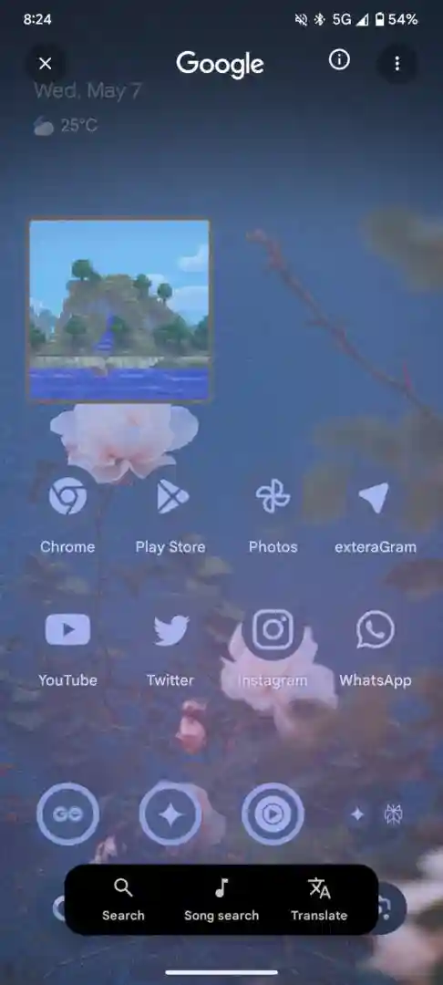
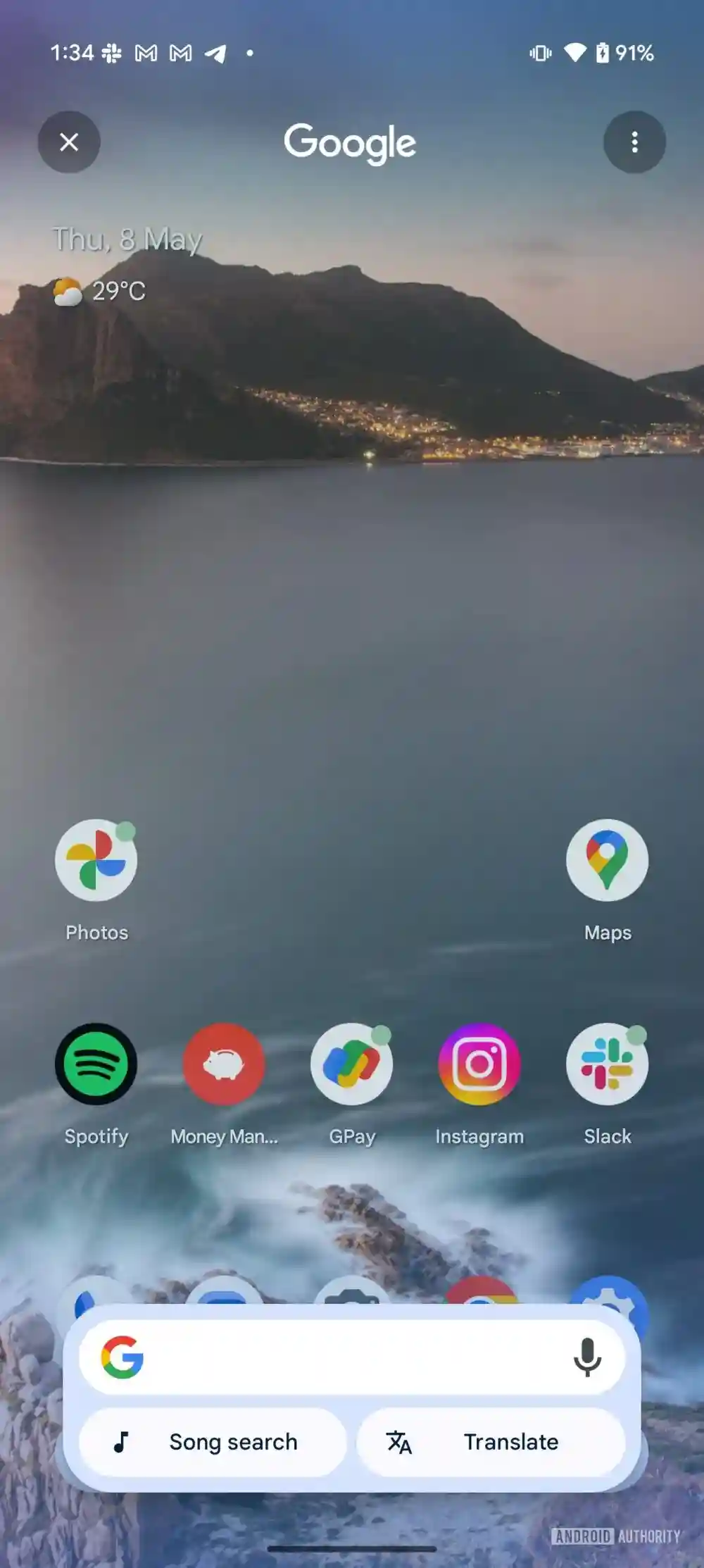
As given in the images above, the first new UI layout for Circle to Search is present in both light and dark themes. Icons and texts for Search, Song Search, and Translate can be spotted. In the second UI layout, the first row has the Google Search bar, and below it the Song Search and Translate pills have been added. Of the two, the second UI layout is now available on a wider basis, meaning this could be rolled out as the new Circle to Search UI design (assuming).
Stay tuned for more updates.