A few days ago, it was officially announced that the much-awaited Google I/O 2025 event would take place from May 20th to May 21st. The company is expected to share details about Android 16 OS, updates concerning its AI (Gemini), and web—and cloud-based services and products.
Google has also confirmed that it will unveil a new version of the Material design theme at its upcoming developer conference, Material 3 Expressive. Android Authority has revealed glimpses of these design changes in Android.
Android UI redesign
New status bar icons and clock font
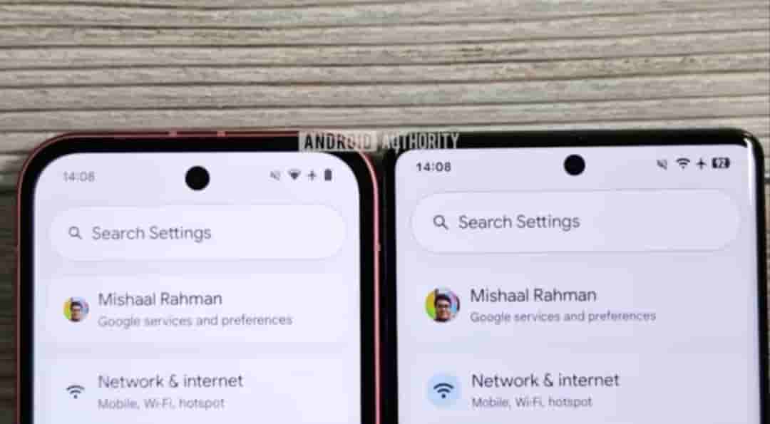
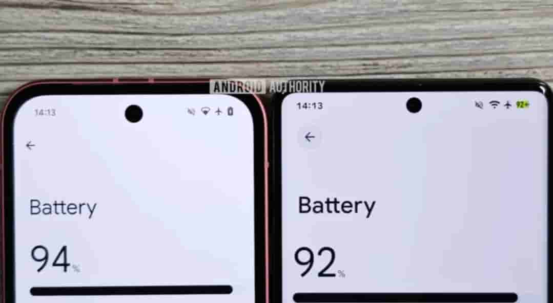
Google has tweaked the icons for WiFi, mobile data, airplane mode, and battery level. WiFi and mobile data icons are now segmented, 5G and airplane mode icons are bolder, while the new battery icon is more colorful, displaying a green background when the device is charging and turning red when the battery is low. Also, the font used for the text clock is now slightly larger and bolder.
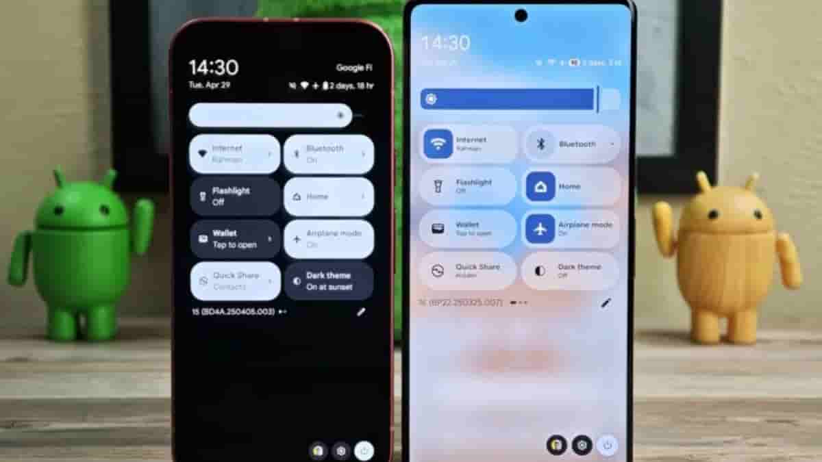
New design for combined notifications and Quick settings panel
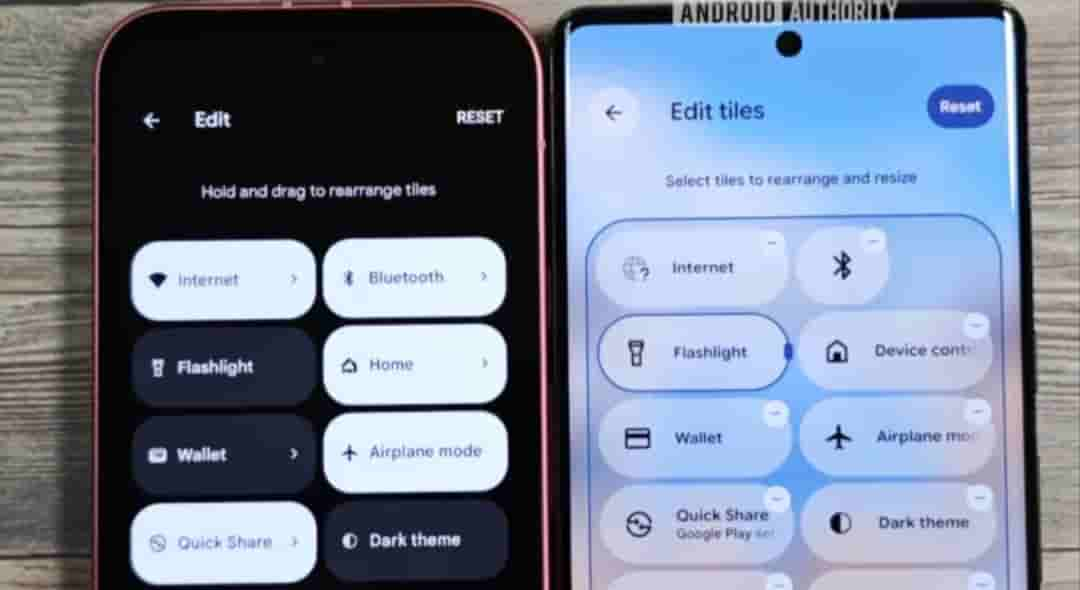
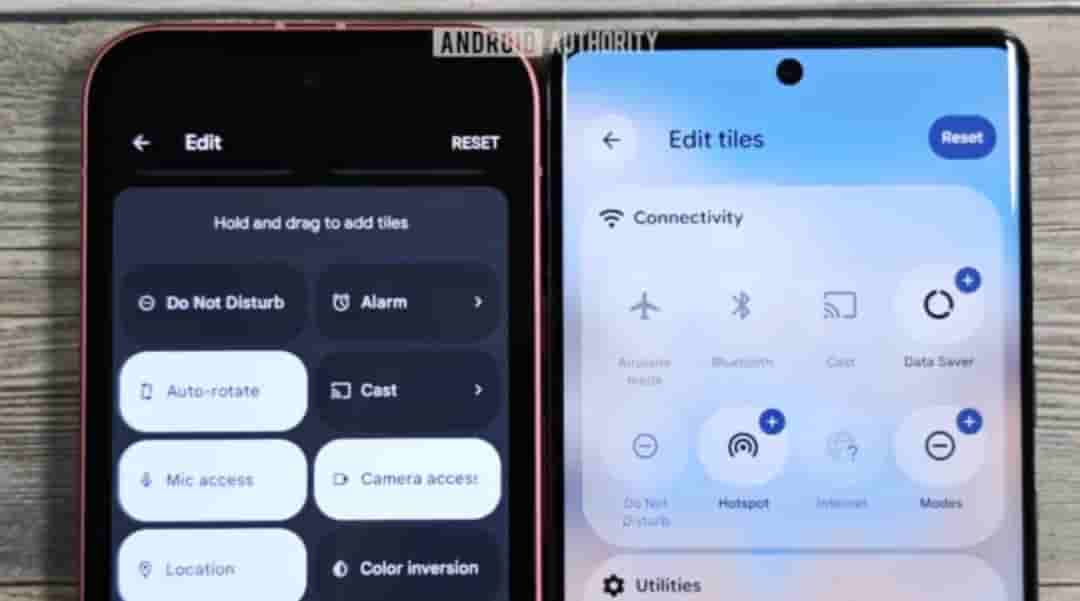
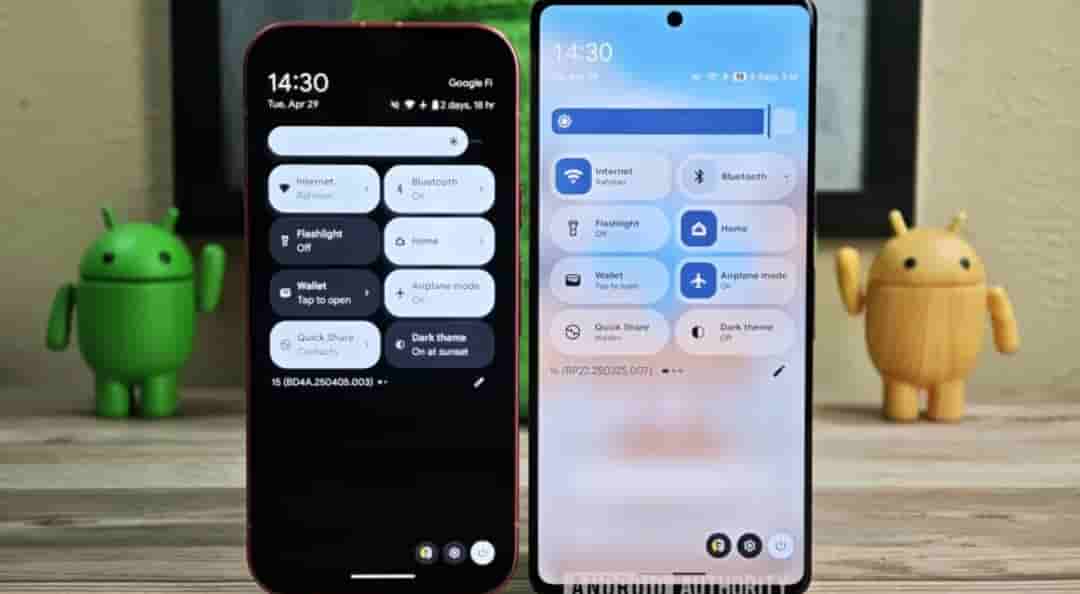
It is said that the company plans to split the notifications and Quick settings panels into separate pages. Though the company currently seems to be moving forward with a different approach for the main interface. This newer design keeps Quick Settings and notifications panel combined, but retains many developments alongside the split concept.
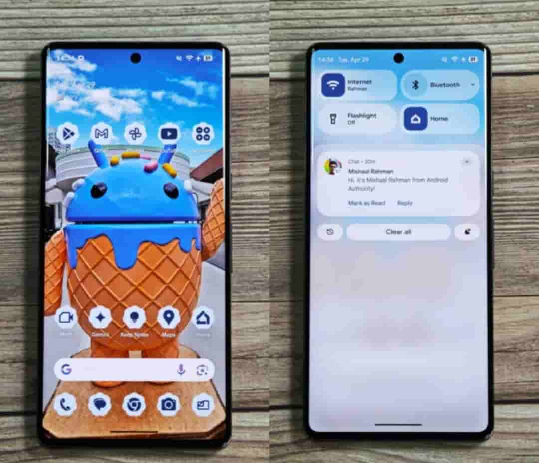
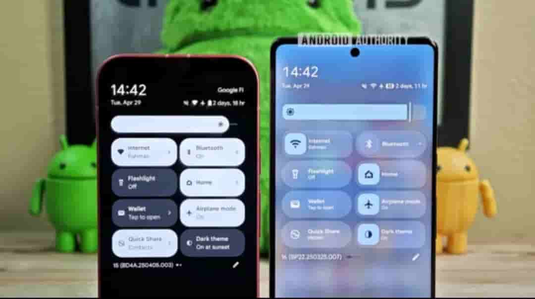
These include resizable Quick settings tiles, new one-click toggles for WiFi and Bluetooth, a more organized tile editor, and one-click shortcuts for adding or removing tiles. It also introduces a redesigned brightness slider, downward-facing arrows for expandable tiles, and a new segmented WiFi icon. Quick Settings/ notifications panel with home screen blurred in the background.
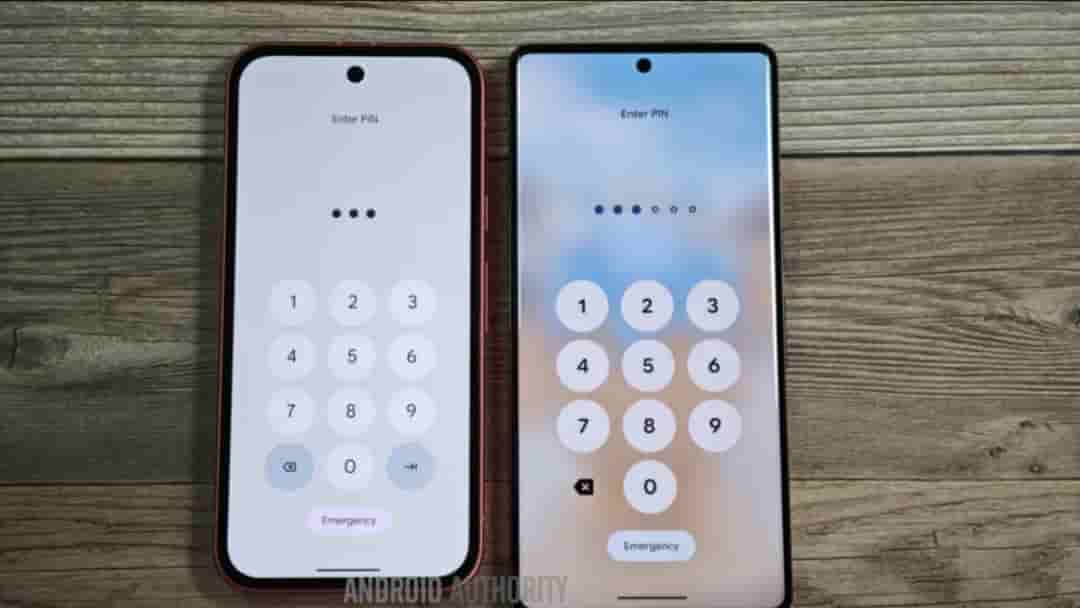
Blur background
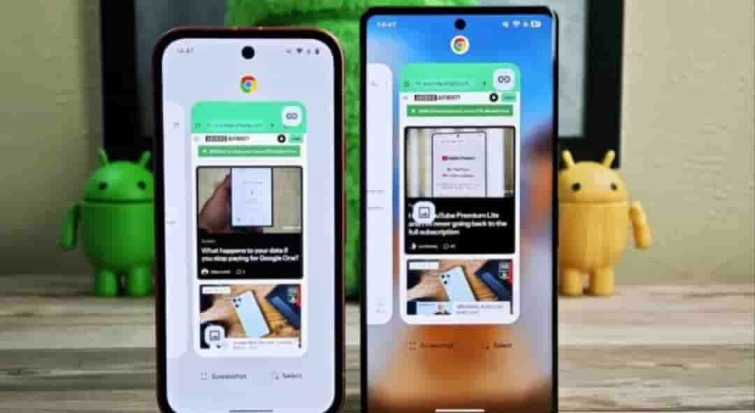
Other than the Quick settings panel, a blurred background also appears in the Pixel Launchers app drawer, the recents menu, and the PIN entry screen.
Compact lock screen
Google moves the date and weather information either below or beside the clock. The date and weather appear below the clock when it’s centered, and to the clock’s right when it’s positioned at the top. Meanwhile, the contextual information complication sits at the top when no notifications are present, shifting below the clock when notifications appear.
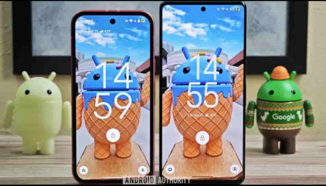

Then there is a new compact notification shelf that shows only the app’s icon in a small, slightly transparent chip, located below the contextual information complication. Tapping this chip expands the notification shade, revealing all pending notifications. This compact view isn’t enabled by default but can be turned on under Settings> Notifications> Notifications on lock screen.
Apart from the blurred background in the PIN entry screen, the dots for each number you have entered now use dynamic colors in line with Material You theming. The numbers are also now slightly larger and bolder, similar to the updated text clock font.
Less bubbly volume and media output UI
New volume UI replaces those thick sliders with thinner ones that include distinct handles. The volume slider that appears when you press the volume key is also changing. The new slider is less rounded and features a thin rectangular handle. The sound mode selector at the top has also been tweaked, other modes now appear within discrete rounded rectangles.
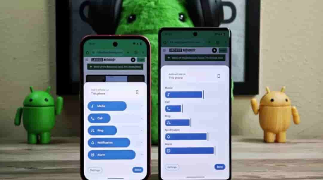
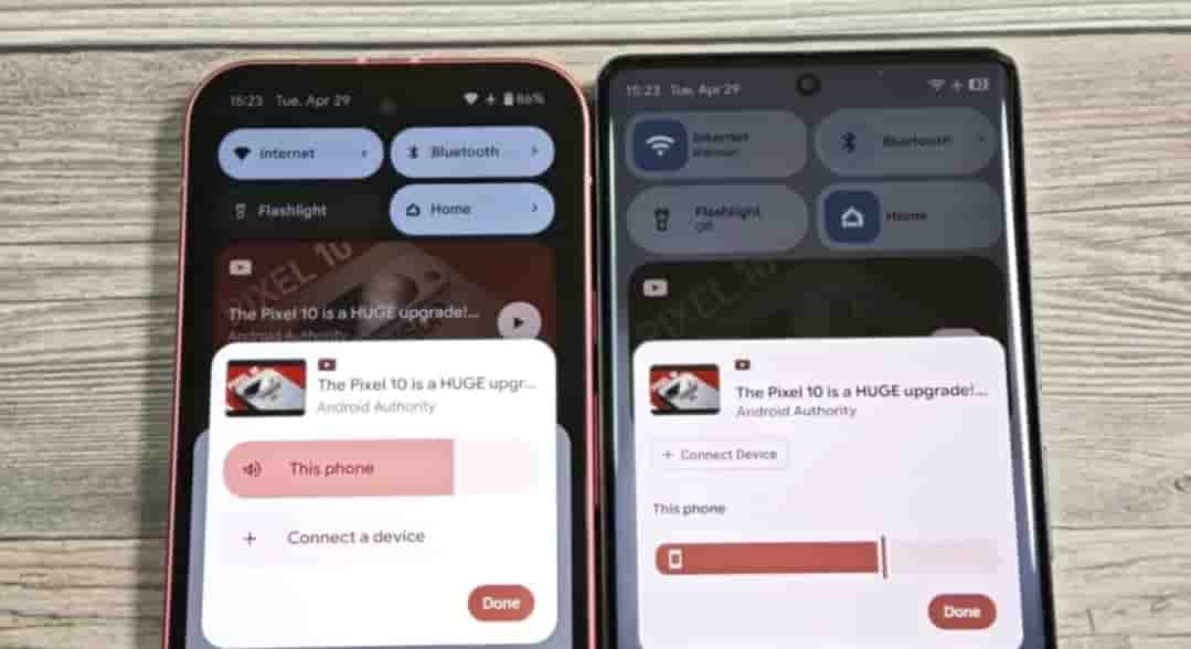
Media output switcher is also getting a redesign, Changes include relocating the Connect a device button significantly higher and swapping the thick, pill-shaped volume slider for a newer, thinner style with a handle. The connected device’s name now appears above the slider instead of inside it, and the large pill shape enclosing each device underthe Speakers& Displays header has been removed.
Expressive settings app
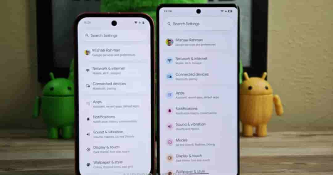
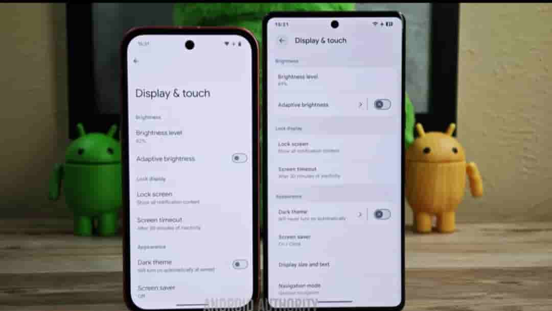
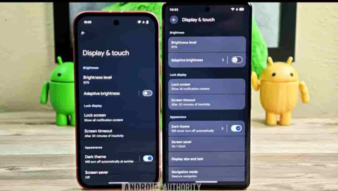
Settings overhaul changes include: colorful icons return to the homepage, newer Material Design 3 switches will be implemented, and each menu item will be placed within separate cards. Right-facing arrows will indicate subpages, page header appears at the very top by default.
New icon shape options
New icon shape options are said to be introduced for Pixel launcher- square, four-sided cookie, seven-sided cookie, arch, and complex clover. The default icon shape is still a circle. The icon shape is not only on the home screen but also in the app drawer.
Readers are advised to take the above info with a pinch of salt, as these changes were spotted through Android 16 betas. It is likely that you may not see a full redesign in the stable release of Android 16, parts or all of it could appear in a future quarterly update.