New Microsoft 365 App Icons Featuring Fluid Forms and Vibrant Colors Officially Unveiled: All 10 Core Office App Icons Refreshed
After 2018, Microsoft 365 app icons have now received a refreshed design change featuring fluid forms and vibrant colors. All of the 10 core office apps have undergone the design change, and while being subtle in nature, it brings a significant difference over the previous icons.
Read more about them below.
New Microsoft 365 App Icons Officially Unveiled
As per what has been stated by Microsoft, the 10 newly-refreshed office app icons are both a reflection and a signal. They encapsulate the role of AI in the design discipline and in the product development, at the same time all of them also embody characteristics like connection, coherence, and fluidity. The brand also adds that even though these were the principles that had guided the previous designs, from the previous meaning of ‘visual consistency’, the new app icons mark a shift in meaning to ‘seamless flow of human intent’.

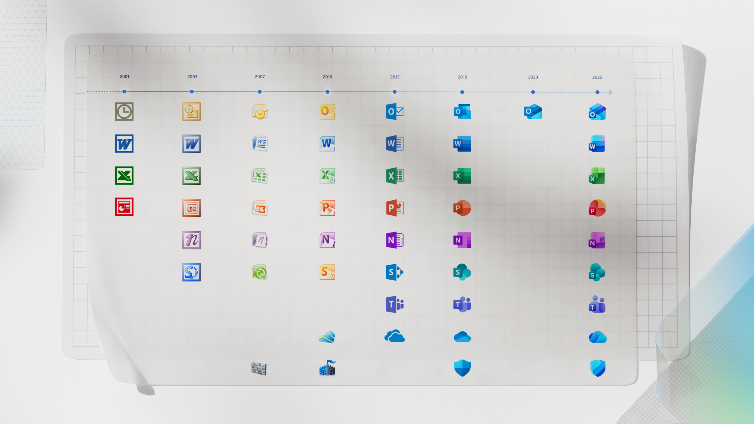
Speaking more, the new app icons are notably inspired from Microsoft’s work on its Copilot icon and on top of this, they are now a little more simplified. Another notable change is with respect to the Microsoft Word app icon, and from the four lines that were there previously, it has been changed to three lines for better visibility at smaller sizes. Moving from the bold and sharp forms, designs are now softer and more fluid. Also, the sharp edges and the crisp lines are now replaced with smooth folds and curves too. Rich color palettes with more vibrant gradient colors that are punchier and dynamic, and instantly recognizable letter plates are further design aspects of the new office app icons.